When we create a new chart in Excel, if the X axis labels are dates, Excel will assume “Automatic” on the Primary axis Category. Please check image below.
 On this example I have dates 1, 2, 5, 6 and 7 of October. Only this dates have data on it.
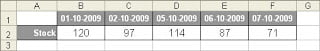 With the option Category X axis set to Automatic, Excel will produce a chart like Chart 1:
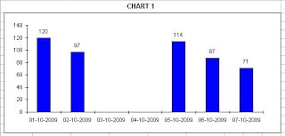
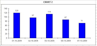
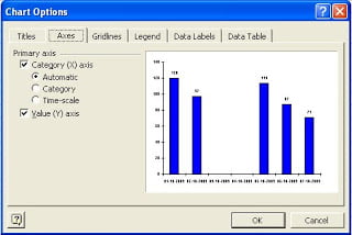
As you can see, Excel has added the dates that where missing between 2 and 5 of October. This dates are not a part of our original table and don’t have value to be charted so I don’t want to display them. This happens because Excel assumes that this is a Time-scale category chart. To remove this dates, go to Chart Options and set the Primary Axis-Category X axis to “Category”. This way we get a chart like Chart 2: