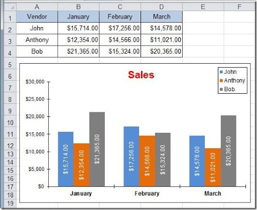
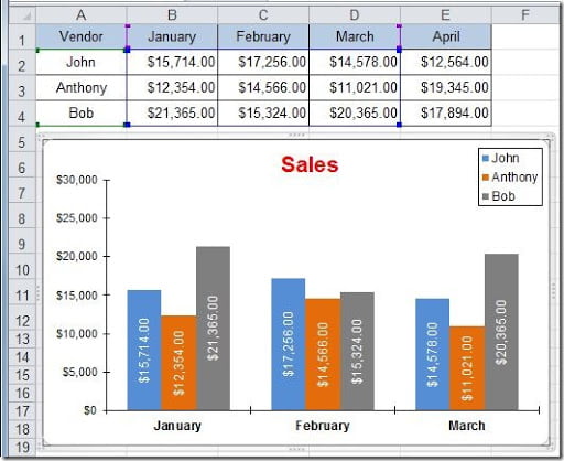
This is a common task on Excel. We have a chart and we need to update the data displayed by adding more data. For instance, we have a chart that displays data from January to March and we need to add data for a new month. Let’s see how we can do this. We have this existing chart:
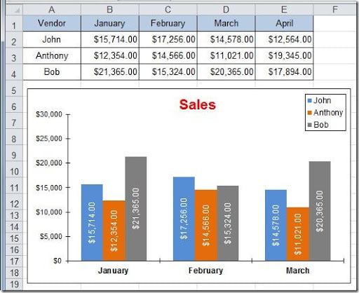
Now lets add a new column to our table to add the April sales data, like this:
There are several ways of adding and additional column of data to our chart. Let’s see some:
Method 1: This is the easiest way of doing this but it’s now always possible to to. Instead of putting the new data on the right side of the last column, insert a new column between columns C and D, copy the March data into this new column and put the April values on column E. Because you are adding a new column inside the source data range of the chart, Excel will adjust to accommodate this new column. As I said, this is not always possible if you have more data below this table. If you insert a new column, it will mess the data below.
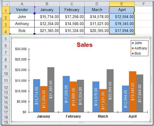
Method 2: Put the April data on column E. Select cells E1:E4 and press Ctrl+C (Copy). Then click on the chart to select it and press Ctrl+V (Paste). You will have your new data displayed on the chart, like this:
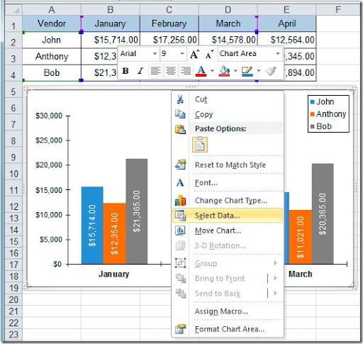
Method 3: This is the usually method that most people use. Right click on the chart and select the Select Data option, of go to the Design tab and on the Data group, click on the Select Data button.
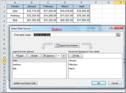
A Select Data Source dialog box opens and the chart source range get’s highlighted with the “marching ants”.
With the cursor on the “Chart data range” field, just select the new data range, in this case select A1:E4. Click the OK button and your chart will be updated with the new data.
Method 4: Click on the chart. If you look at your table now, you can see blue, green and violet lines around the cells.
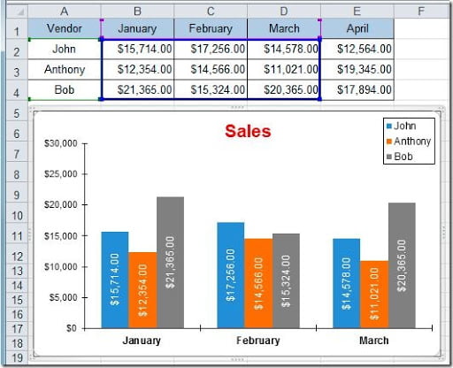
If you pass the mouse on top of the blue line, it will get thicker showing you the actual source data of your chart, like this:
Just drag the line, pushing from one of the blue squares on the corners, so that you get the new range of data selected, in this case range B2:E4 and release the mouse button so that your chart gets updated.
As you can see, there are many ways of doing the same thing in Excel. You just need to choose the one that you like it more.
