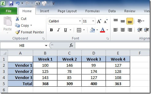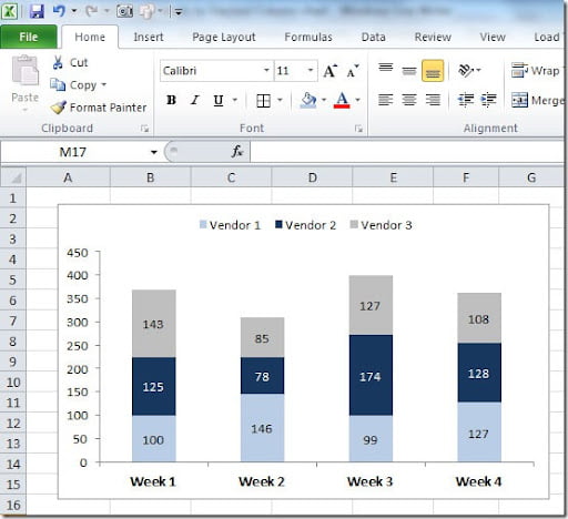
I can make a Stacked Column chart with 3 series, one for each Vendor. The chart will look like this:

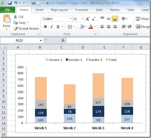
But I want to display on the top of each bar, the total for the Week (the sum of each Vendor). To do that, I need to add a 4th series to the chart. For that I select the chart and right-click on top of it and select Source Data. On the Series tab, on the Series, click on the Add button to add a new series. For the Values range, select the cells where the values of Total are on our table. For the Name, select the cell where we have "Total". Click OK and you will get a chart like this:

Select this new series on the chart, right click and choose Format Data Series. On the Data Labels tab, Label Contains mark Value. Then on the Patterns tab put Border-None and Area-None. Click OK. Now select the labels, right click on them, choose Format Data Labels and on the Alignment tab, Label Position choose Inside Base. Click OK. You need to adjust the scale of your chart so that it looks like the original one. In this case, I changed Maximum value to 450 instead of Automatic. As you can see, the “Total” series name still shows up on the Legend. You need to select the Total legend and delete. The final result will be this something like this:

Hope this helps you create better charts in Excel!
