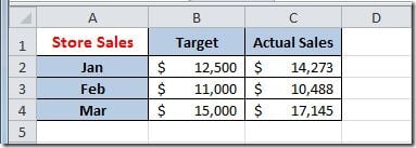
I’ve a table of data with target values and actual values, by month, like this:
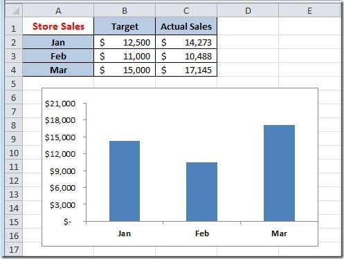
I want to create a bar chart with this data, something like this:
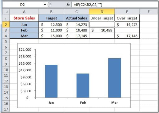
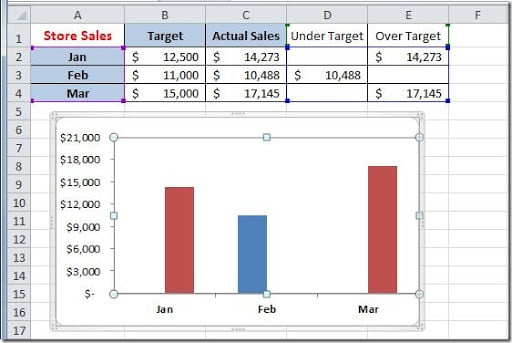
But I would like, for better understand the data, to see if the actual values, for each month, are above or below the target value. If it’s on target, or over the target, I would like the month bar to show up in green color and, if it’s below target, to show up in red color. This can be done by adding two columns to our table, one for the results “under target” and one for the results “over target”. On this two columns, what we are doing, is to check if the actual sales value is less that the target, then show the actual value; if not, leave the cell blank. This for the “under target” column. For the “over target” column, we are going to check if the actual sales value is equal, or greater than the target value. If true, then, show the actual sales value; if not, leave the cell blank. The result will be like this:
For the “under target” column, put this formula on cell D2 and copy down:
=IF(C2<B2,C2,””)
For the “over target” column, put this formula on cell D2 and copy down:
=IF(C2>=B2,C2,"")
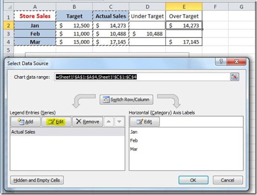
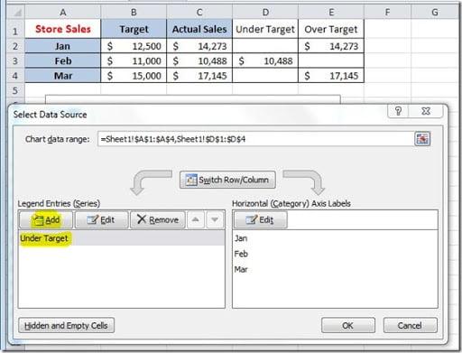
Now we need to change our chart data source. If you right click on your chart and select “Select Data”, it will open the “Select Data Source” dialog box, like this:
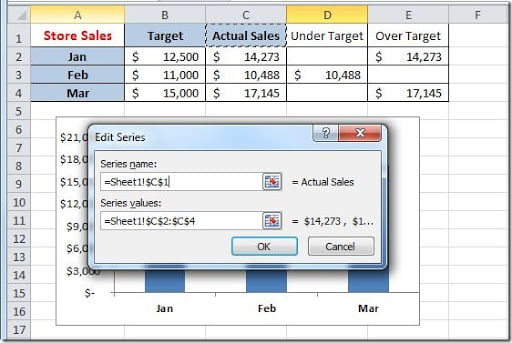
As you can see, your chart has only one data series. We are going to work with two data series: one for the “under target” values and one for the “over target” values. To start, we are going to change the series values for the existing series. For that, click on the Edit button on the Series box, on the left of the dialog box. This is pointing to column C, as you can see on the image below. We need to change the “Series name” to “=Sheet1!$D$1” and the “Series values” to “=Sheet1!$D$2:D$4” and click the OK button.
Our chart series in now point it out to the “under target” column. We need to add the second series for the “over target” values. Click on the Add button, on the Series box:
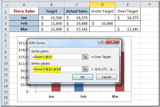
Fill out the “Edit Series” dialog box, like this, and click on the OK button:
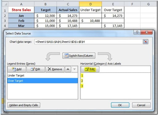
As you can see, you need to specify the “Horizontal Axis Labels” for this new series because it’s not showing up the months names. Just click on the Edit button and select the “=Sheet1!$A$2:$A$4” range.
Close the “Select Data Source” dialog button, by clicking the OK button, and your chart should now look like this:
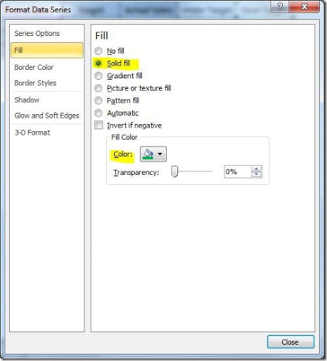
We need to change the color of our series bars to display the “under target” values as red bars and the “over target” values as green bars. Just right click on the “over target” bars and select “Format Data Series”. Go to the Fill group and select “Solid fill” with a green Fill Color. Click the Close button when finished.
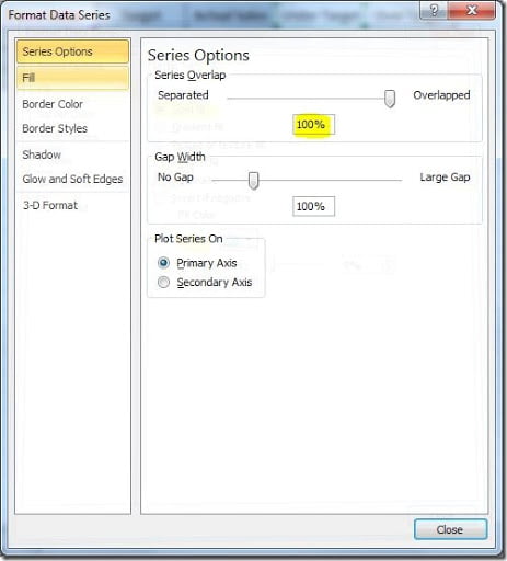
Do the same for the “under target” series but for this select a red Fill Color. Before clicking on the Close button, select the “Series Options” group and on the “Series Overlap”, put 100% so that the chart bars appear center between each month.
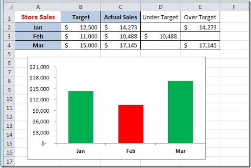
When you click the Close button, the result should be like this:
Try changing any value on the B2:C4 range to see the conditional formatting of the chart adjust the colors.
