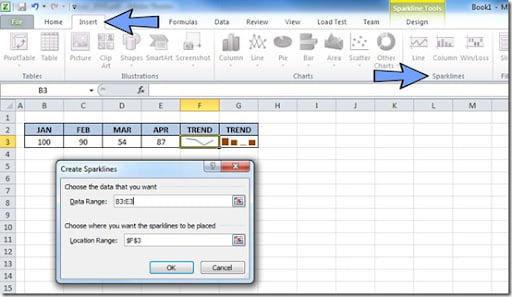
Excel 2010 has a new feature called Sparkline charts that allows you to place a mini-chart inside a cell on your sheet. There are 3 type of sparkline charts: line, column and win/loss. The line and bar charts are very useful to show you a trend about your information while win/loss charts show you positive or negative numbers across a horizontal axis, represented by squares that show positive values if they are above the horizontal axis or negative if they appear below.
To create a sparkline chart, just click on the cell where you want your chart to appear. Click on the Insert tab on your menu bar and click on the type of sparkline chart that you want. A “Create Sparklines” dialog window will appear. The cell that you’ve selected on your sheet will already appear on the field “Location Range” of the dialog window. Click on the “Data Range” field and select on your sheet the range that you want to use on your chart. The range will appear on the “Data Range” field. Click OK and you’re done.
On this picture, you can see on cell F3 a line sparkline chart and on cell G3 a bar sparkline chart.

On the next picture, you can see on cell F3 an example of the win/loss sparkline chart.

Excel articles writen for the common user to help you improve your skills…
About Me
- Setúbal, Portugal
- Been using Excel for more than 10 years and still learning every day. Just started working with Excel 2013 and I'm lovin it!

Recent Articles
- 1,000,000 Pageviews
- MS Excel 2013 Quick Start Guide (“Cheat Sheet”)
- Install Excel 2013 side-by-side with Excel 2010
- "Your top 10 favorite Excel post of 2012" from Microsoft Excel Blog
- uCertify — Online Version
- Lookup with multiple criteria's
- AutoSum
- Conditional Formatting bar chart
- Add new data to an existing chart
- Add automatic subtotals
- Copy visible cells only
- Fill Blanks on column
- "VLOOKUP Great White Shark Award"
- Hide values on column for better looking when printing
- Format Painter: quickly copy formats
Recent VBA Articles
Popular Articles
Tags
Top
Copyright 2009– Excel-User.com • Privacy policy