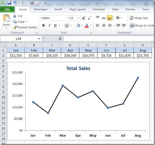
Excel line charts can have some different line markers but you can also use images to personalize your charts and give them a different look. When you create a line chart, it will look something like this simple example:
Here we have some diamond type line markers but we want to change this for a dollar sign marker. To do this we start by adding an image to our worksheet by going to Insert tab on our menu, then on the Illustrations group we can choose to add a Shape, Clipart or a Picture. Then format the image to a size that is suitable to the chart where you want to place it. Select the image and press Ctrl+C (Copy). On your chart, click on the line series to activate it. The line markers on your chart will be selected. Press Ctrl+V (Paste) to copy the image to your line markers and that’s it. Your chart will look something like this:
You can also have different images for each line marker. For instance, I could put green dollar signs on the months where the sales values increased and red dollar signs where the sales values decreased. When you Paste your image to your line markers, you can choose only the ones that you want to change the images instead of all the line markers.


