When making an Excel worksheet, there are some basic rules to follow so that your sheet looks nice and with a professional look. Here are some tips on how to improve your worksheets:
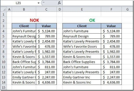
1 — Adjust the rows and columns size to fit your data in. Don’t have columns where your data is not completely visible, like this:
2 — Avoid merged cells! Instead use “Center Across Selection”, as mentioned on this article.
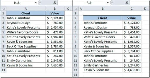
3 — Don’t use row 1 and column A. Your sheets will look nicer if you leave this empty. Take a look at the picture below where I’ve left row 1 and column A empty on the image to the right and compare it to the image on the left to see the difference it makes:
4 — Pay attention to colors. For the sheet background use white and for the text use black. Restrict the number of colors you use on your sheet. Use one or two more colors for pointing out something important on your sheet and you can also use a grey color on parts of your charts, like the labels, gridlines, axis.
5 — Use only one or two fonts on your sheet. It’s also a good design basic rule not to use multiple fonts on your sheets. You can use one for your titles and another for the rest of the data. That’s all!
6 — Align all of the elements on your sheet. Charts should be aligned to the grid and made with the same width and height of the cells where you want to place them. To help you align a chart or picture with the gridlines of your sheet, click on it and on the Format menu tab, on Arrange group, click Align and select Snap to Grip.
7 — Turn-off Gridlines, sheet Headers and Chart borders. When you finish building your sheet, this is a good way of giving it a better look. Go to your View menu tab and on the Show group, uncheck the Gridlines and Headings to remove the gridlines and the headers of your sheet. Right click on the charts on your sheet and select Format Chart Area. On the Border Color option, click on the No Border option to remove the borders of your chart.
8 — Use charts to present your data but avoid 3D charts. 2D charts look more modern and are easier to read than 3D ones.
9 — Put names on everything. You should always name your tabs on your workbook to avoid the default “Sheet1” and better find your data and be easier to interpret your formulas. This is easier to understand:
=SUM(January!B3:B13)
Than this:
=SUM(Sheet1!B3:B13)
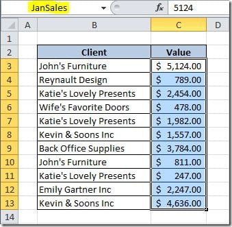
Also name your cells range. It also makes it easier to read formulas. Here’s an example:
Just select the range of data (in this case C3:C13) and on the Name Box write the name that you want to give to this range of data, in this case, I’ve named JanSales. Now, I can use this named range on a formula like this:
=SUM(JanSales)
Isn’t this better looking and a better way of reading data on your sheet? If your sheet tends to grow, later it will much easier to read data on it and understand how the values where calculates.
10 — Use image on your sheets. Many of the sheets that you produce, are to be printed in paper, are used to generate reports. They will look much better if you use pictures, like logos for instance, to improve the look of them.


